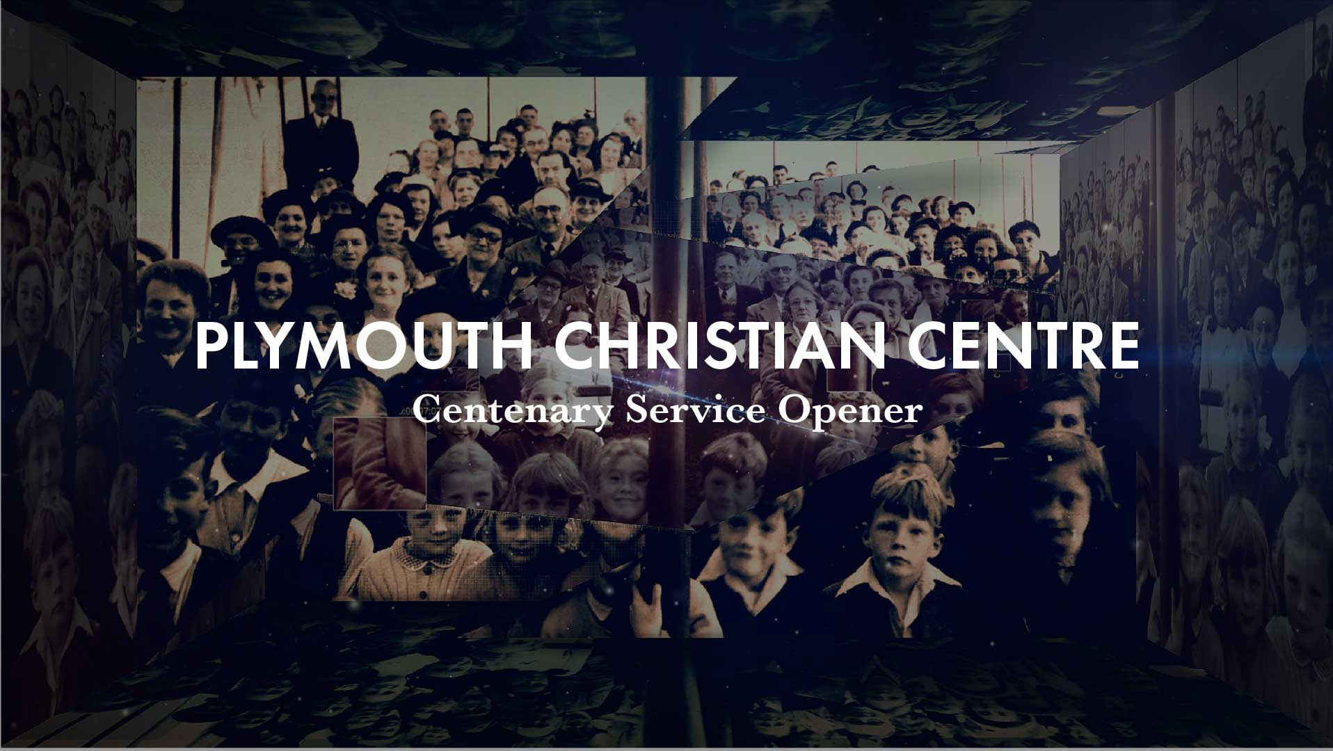
In 2013 I went to the cinema to see the film 'Rush' by Ron Howard. I became inspired. The next day I decided to create illustrations of Formula 1 cars.
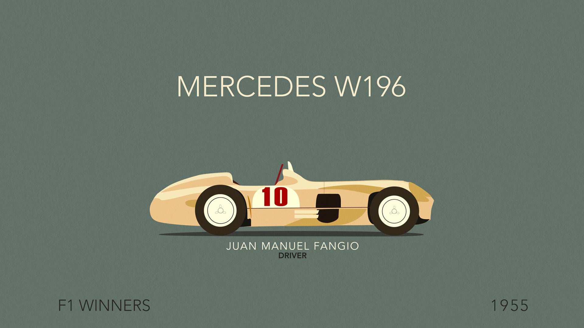
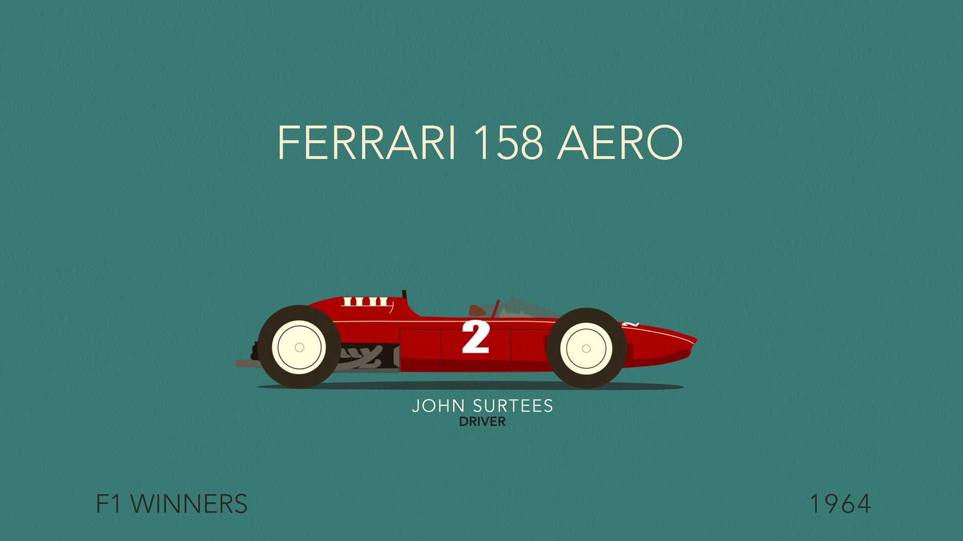
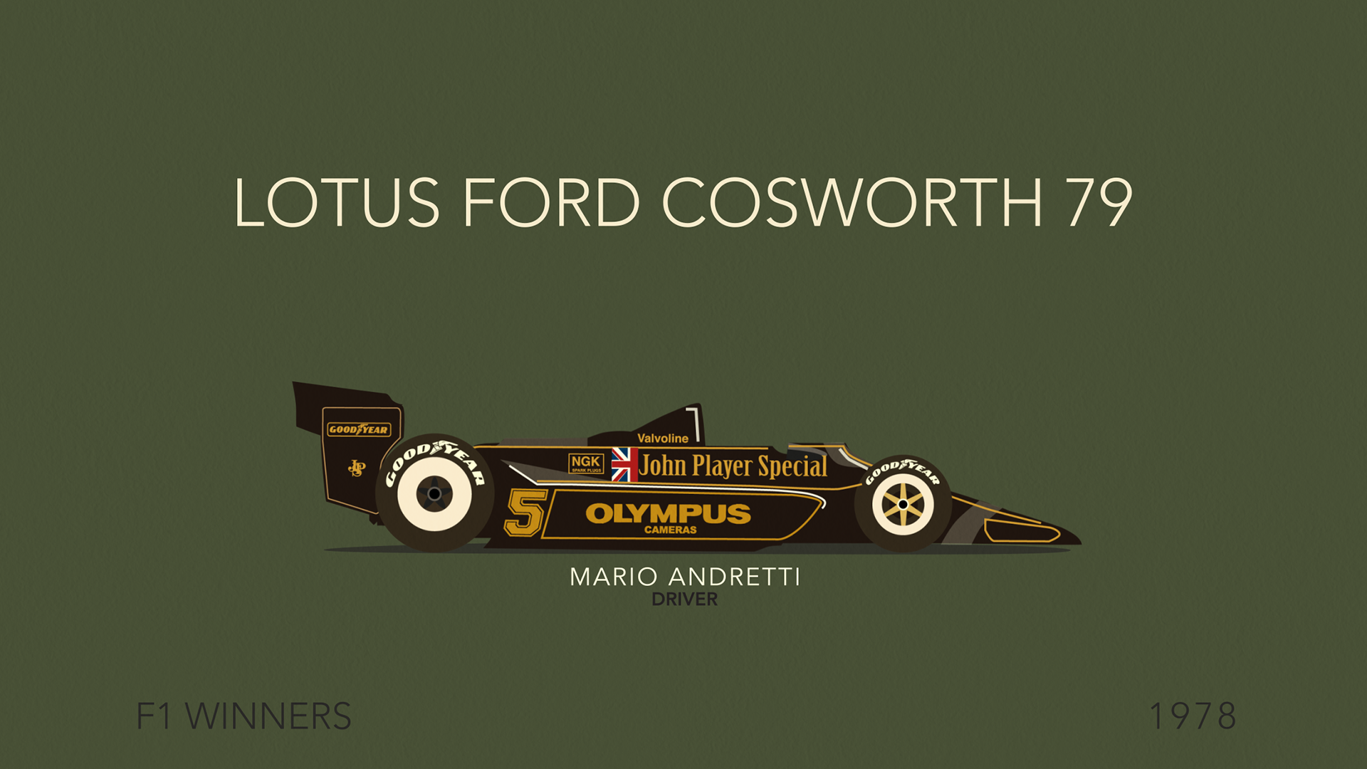
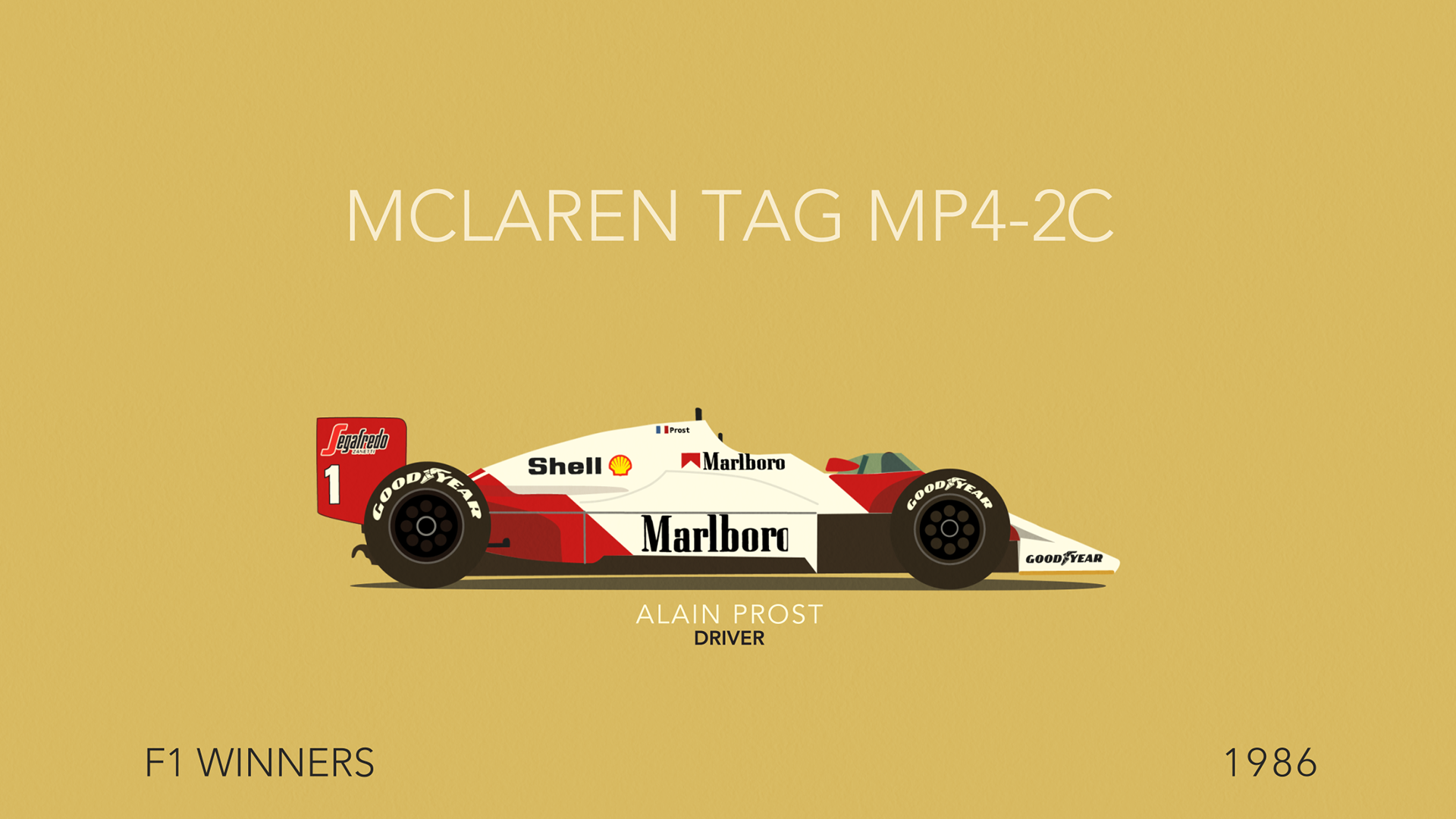
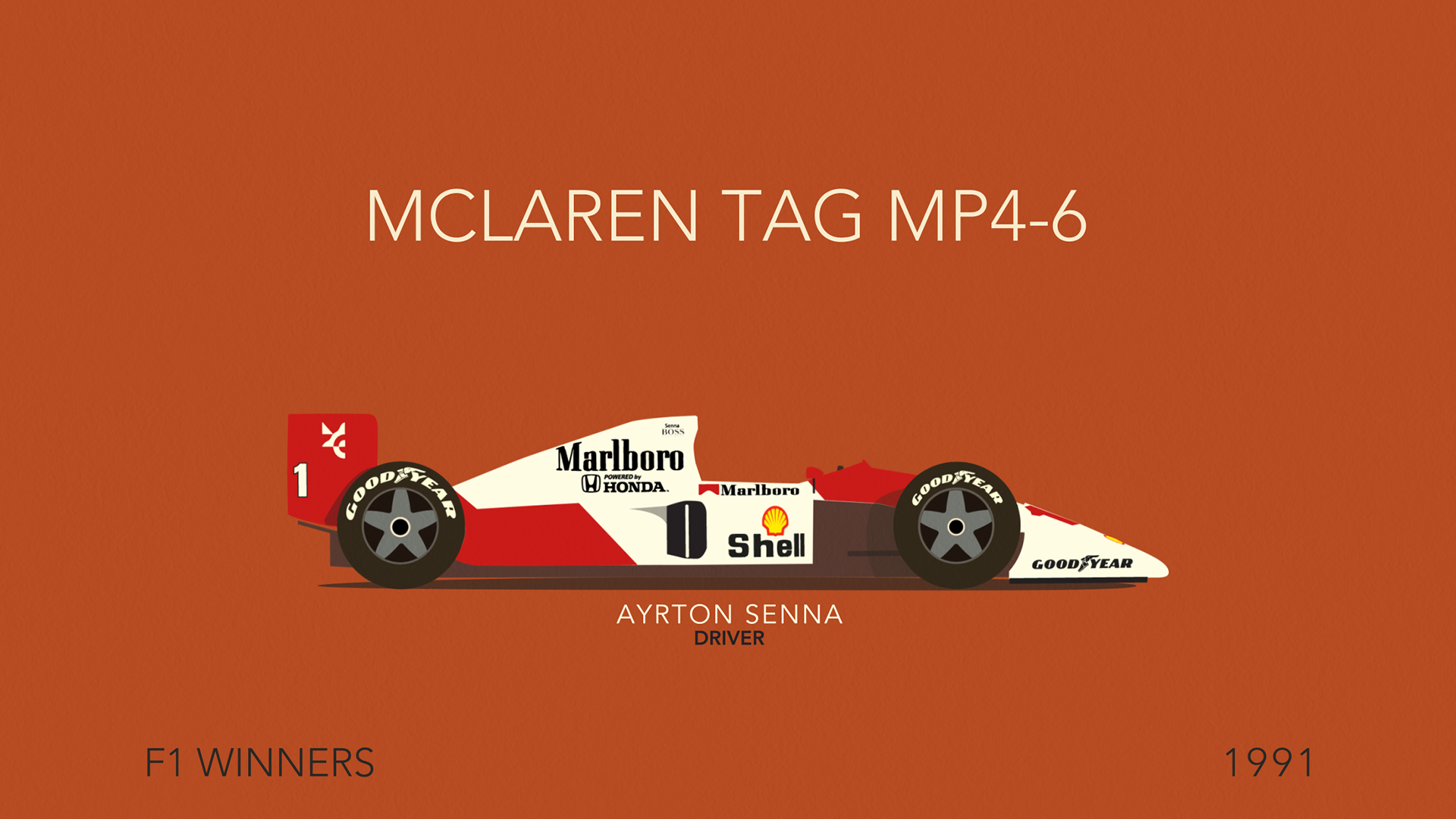
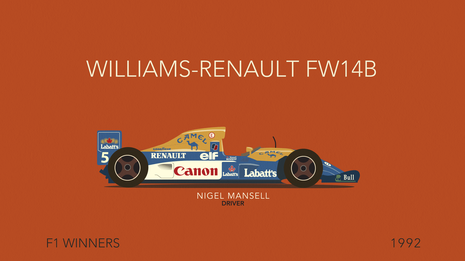
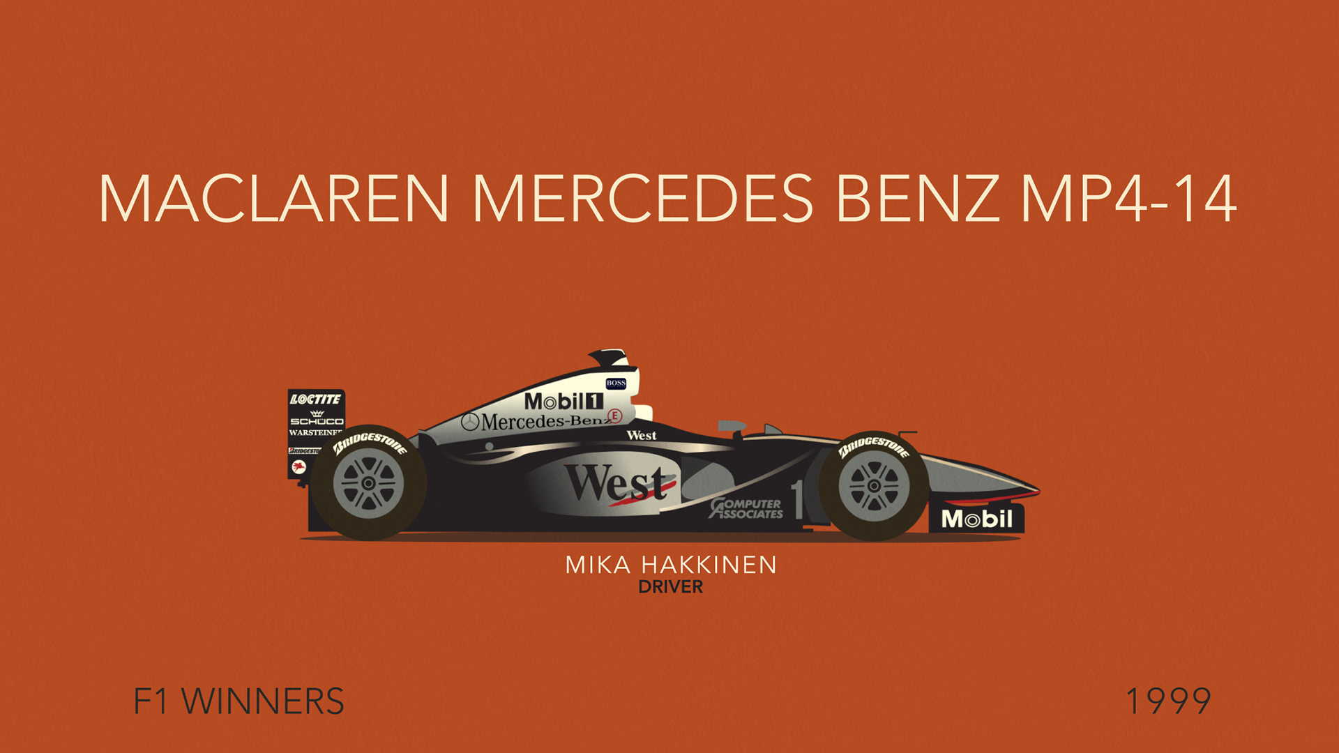
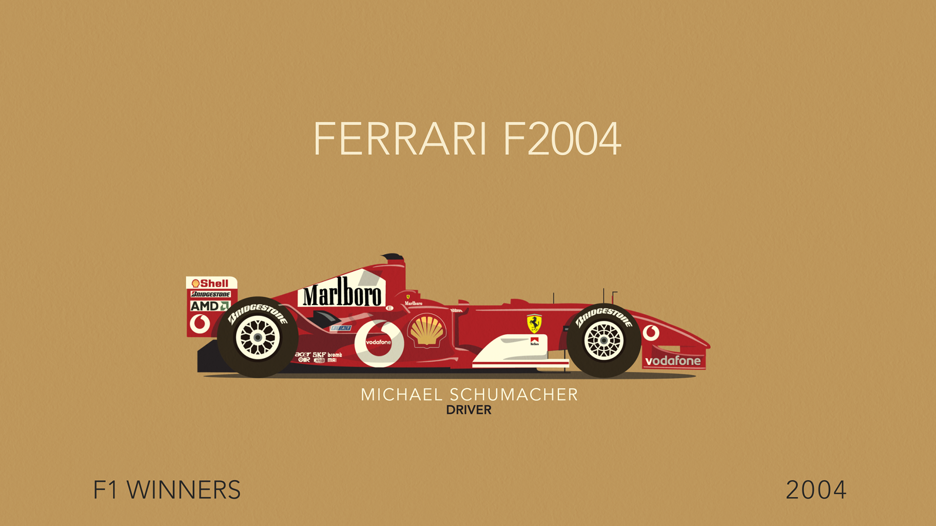
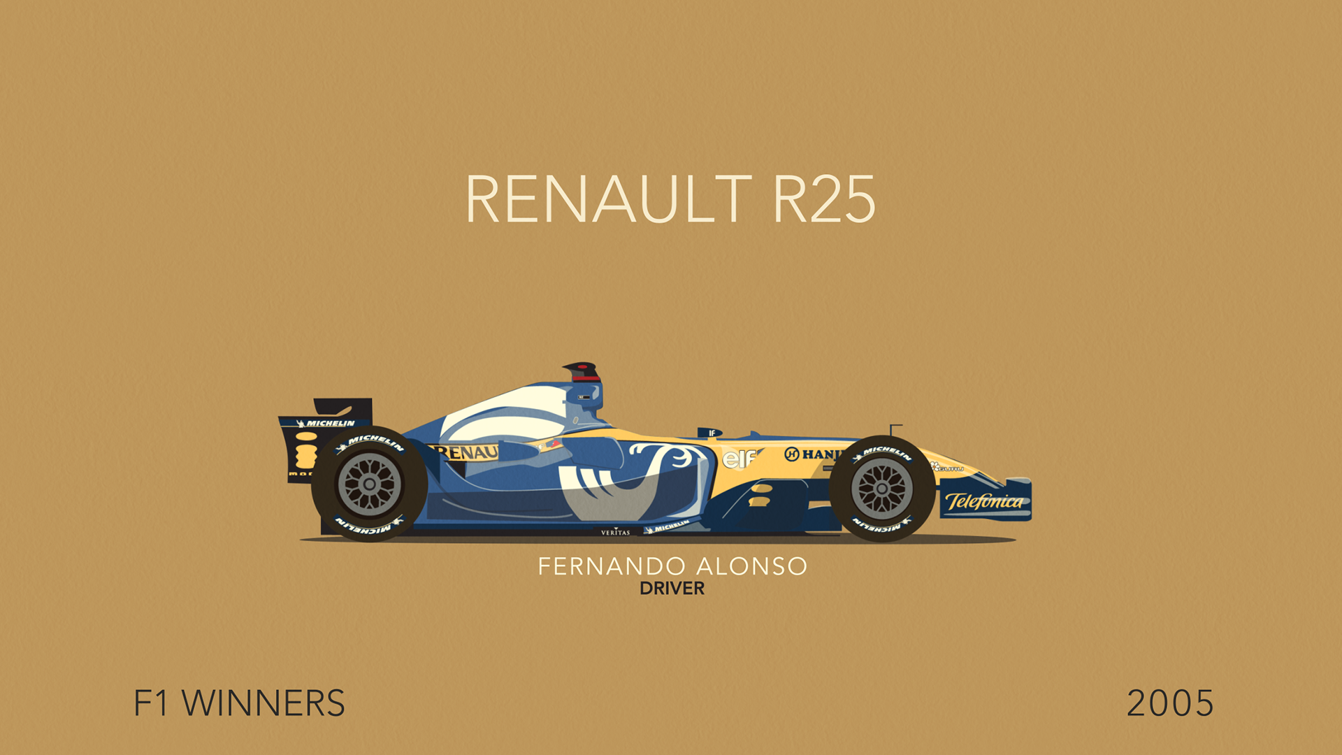
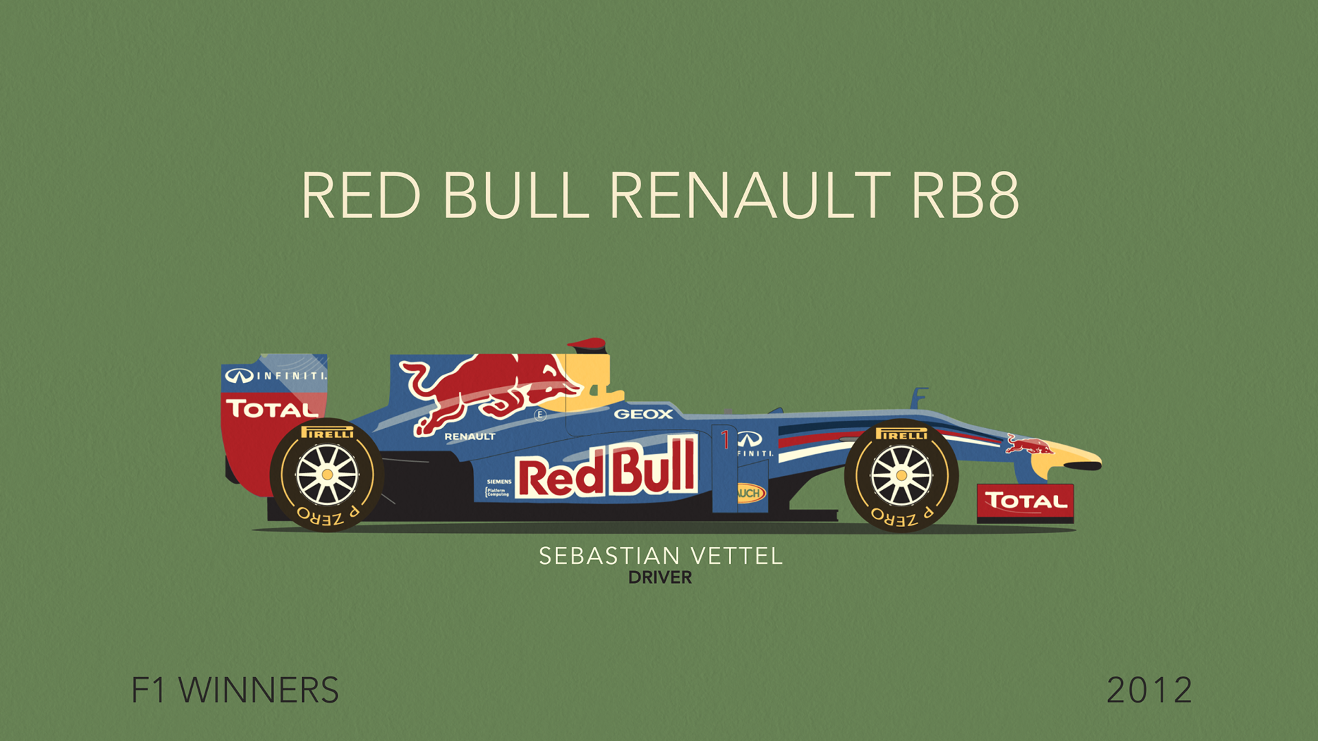
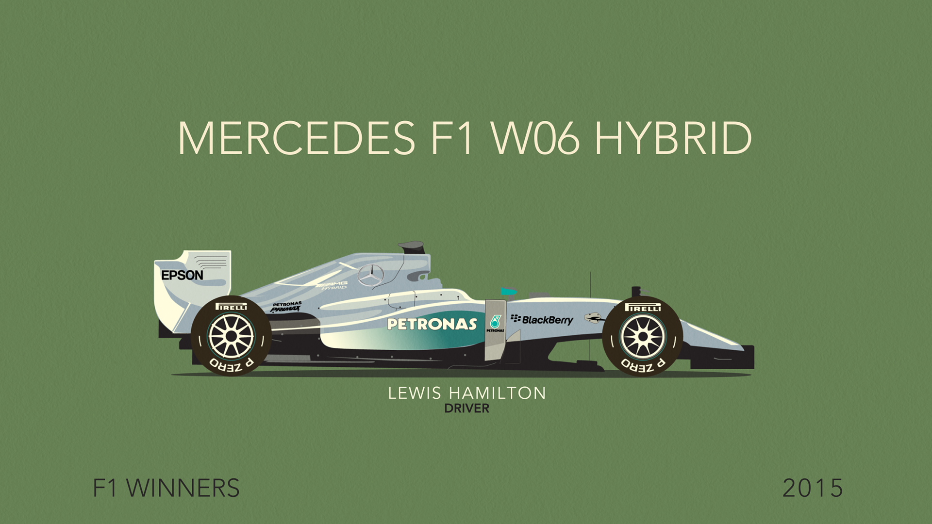
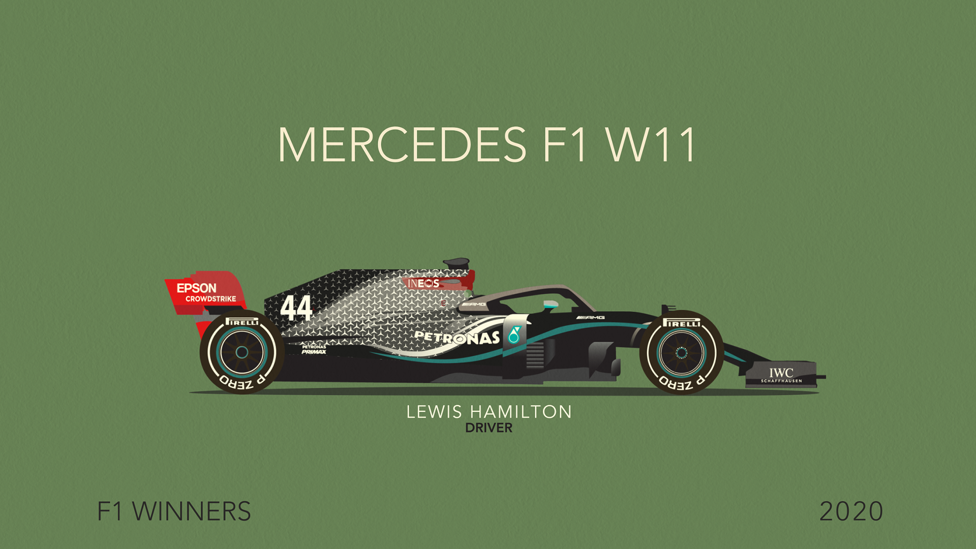
I decided a limited amount of colours, using mostly the Adobe 'Baroque' palette. The earlier cars were rather simple. But as the years progressed, they became more detailed with sponsorship and creative colour designs, leading to 140 shape layers.
Part way through, I was led to what could be considered a foolish thought; to bring the cars with all their separate layers into After Effects and animate them all, thus showing the progression of design and technology as car markers strived for success.
In After Effects I discovered there is a limit to how many layers the software would show me; after 962 layers all the information disappears. I therefore had to develop techniques to pre-comp what I could, but still be able to make revisions easily. My project had a total of over 4000 layers.
In the end, this project required a massive amount of perserverance to complete what could take 4 hours for each car - from illustration to final animation - and fitting around paid work and family life, there were many late nights.
It was interesting to see the progression of aerodynamics, but also colour design with influences by major sponsorship. It was a special moment when I reached 1976 as this is the year 'Rush' focussed on.
Which one is your favourite?
Next challenge: Completing the 75th anniversary by 2025!
A N I M A T I O N
P O S T E R
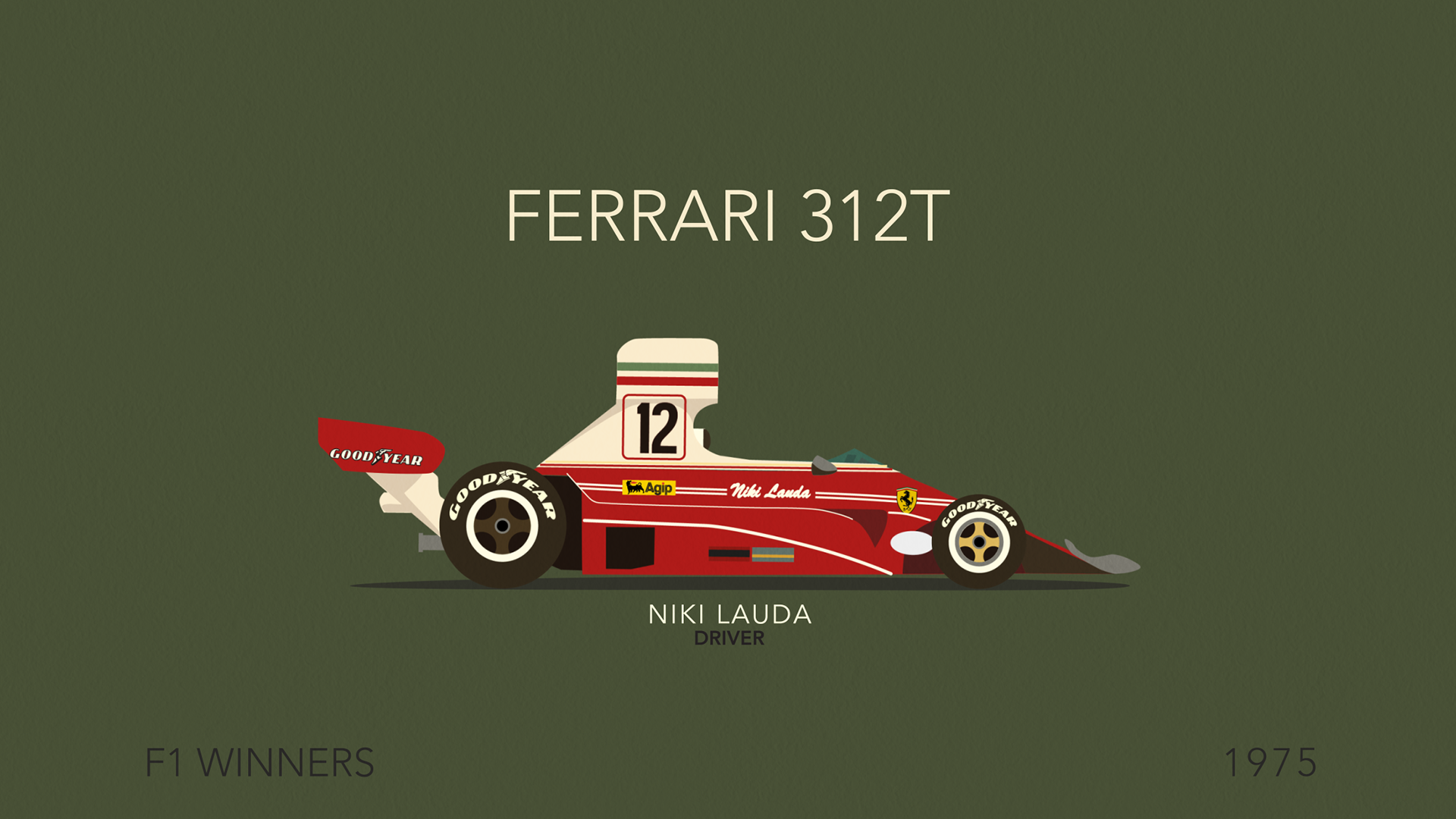
N I K I L A U D A 1 9 7 5
F E R R A R I W I N N E R S
